5 dos (and 1 dont) for map visualisations
Jacqueline StählinChristian Erni
For sure you have come across map visualisations, where geographical data is represented directly on a map. It is commonly used in newspapers but also in business intelligence to visualise regional data, so that a representation familiar to almost everybody can be used.
However, there are some pitfalls when it comes to properly visualising data on maps. Here, we outline 6 best practices for map visualisations.
1: Show relative rather than absolute numbers
Consider the graph of the total taxable income per canton in 2017 (Fig. 1, top left). It implies that the taxable income was highest in the canton of Zurich. However, this graph represents the absolute taxable income and is thus driven by the number of taxable people living in the canton (top right).
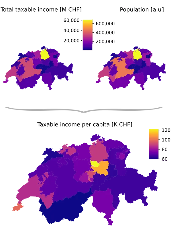
The graph below is normalized for the taxable population by calculating the taxable income per capita. The per-capita income is highest in the canton of Zug — arguably a more interesting finding than just learning that the canton with the largest number of tax payers also pays most taxes.
PS: this map visualisation problem is so common it even has its own comic.
2: Prefer marks or hexbins over choropleths
Consider the small canton of Geneva in the three maps below.
In the first one (Fig. 2a), the area of the canton of Geneva is so small its color is barely visible, let alone comparable.
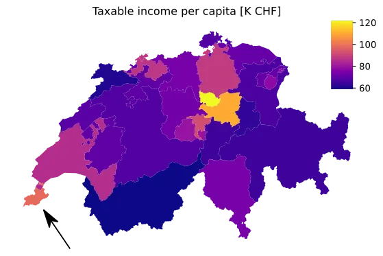
In the second (Fig. 2b), the measure is shown by size of the overlapping red circle instead of the color alone. It is more apparent that also the canton of Geneva has a high taxable income per capita.
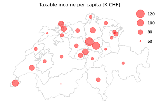
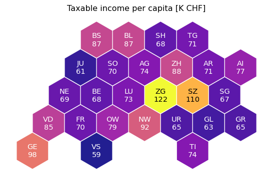
The most elegant solution is the third one (Fig. 2c). It assigns the same area to the locations while preserving geographical context. At the same time, it does not create overlapping marks, thus preserving full readability.

3: Put a label on it
To make things even easier for your hexbin map reader, label the tiles with their corresponding value. It is a general visual best practice to make it as easy as possible for the reader to figure out which value is represented (Fig. 3).
4: Try a lower regional granularity
In some cases, the high aggregation can lead to misconceptions. In the graph below on the left, for instance, it seems like Switzerland has a more or less equal taxable income per capita across all regions, ranging only between 60K and 120K CHF taxable income per year. Looking at the taxable income on a community level, we discover that there are some big outliers with an income of up to 700K CHF. An example is emphasized in the “Inset Lake Geneva” region.

These two graphs directly lead us to our next topic: color scales. For these two maps, the same continuous colors were scaled to the full data range. For the map on the right, the outlier communities are dominating the upper limit of the color scale and the color distribution is too even for the rest of the data. Smaller differences are not easily picked up: while some variation in the inset Lake Geneva can be picked up, there is no perceivable color variation in the “Inset Ticino”.
Although a continuous colormap captures data in a quantitatively correct manner, we always perceive color in the context of surrounding colors. This makes color comparisons over continuous color ranges particularly challenging.
That’s why you should:
5: Color in discrete steps and be wary of discretisation method
Consider the same plot as in Fig. 4, but with discrete color steps (Fig. 5a right). In this figure, the color has been discretized using equal intervals binnig method:

The equal intervals binning cuts the color range into bins of equal width. Each discrete step in the colormap is easily interpretable as it directly corresponds to an increase of 154 kCHF in average income. While quantitatively accurate and easy to grasp, this scaling puts a lot of focus on few outlier communities (Inset Lake Geneva) in long-tailed distributions. 90% of the communities have average per capita income between 27K and 137K and thus fall into the same color bucket — as highlighted by the colorbar visualized as a histogram (top right in Fig. 5a).
To preserve information in cases where values vary over several orders of magnitudes, transforming the data using a log transform before equal binning helps — as evident in the graph using Equal intervals in logarithmic space (Fig. 5b, left):

Using equal intervals binning in logarithmic space, each unit difference corresponds to a fold change. Thus the scale is split into equal fold changes and groups communities with a similar order of magnitude income. In this example, a jump in color scale roughly corresponds to a doubling in average tax income. While still mostly preserving the large differences around Lake Geneva (Inset Lake Geneva), this transformation further reveals that a cluster of communities in the south of Ticino tend to have a roughly 2 fold higher average income than the communities in the north — an information with potential political impact.
Sometimes the absolute values do not matter so much in discussions, but a focus is put if communities have low/high/average incomes in comparison to all of Switzerland. To get such a qualitative view, simply ranking the communities according to their average income and then equally binning these ranks is a good choice . This approach is called Quantile binning (Fig. 5b, right).
This Quantile binning enables easy comparisons between communities in relation to all of Switzerland. The fact that most communities around lake geneva (Inset Lake Geneva) belong to the highest income communities (top 14%) is emphasized. This visualization also nicely reveals that the north of Ticino (Inset Ticino) has a low average taxable income compared with the rest of Switzerland, while the south has an above average income.
In addition to statistical binning methods described above, there are also some algorithmic binning methods available. The most popular approach for this is the family of “natural breaks” methods. An efficient implementation to obtain such breaks is the Fisher-Jenks binning algorithm (Fig. 5c, left):

Fisher-Jenks binning aims to preserve inherent groups amongst the points and is robust to single outliers. As the binning does not have any predefined meaning apart from capturing groups, these approaches require the reader to pay particular attention to the labels of the bins.
It is important to be aware that also algorithmic methods have assumptions on the data: The algorithm behind Fisher-Jenks assumes that absolute differences between values are most relevant. As discussed above, in real-world data relative differences are often more relevant. Particularly as larger values tend to have larger absolute variations. Applying Fisher-Jenks on logarithmically transformed values further improves the visual appearance by emphasizing relative rather than absolute differences (Fig. 5c, right). For instance, the accumulation of high-average income communities around lake Geneva and Zurich is now prominent. Also, the North-South differences observed between communities in Ticino are more evident in this visualization than they were before. This method manages to simultaneously preserve details in low and high income regions and is thus often an excellent choice.
In summary, the choice of discretization is closely linked to the message the map aims to convey. Two practical tips to facilitate your choice:
- Do you want to enable comparisons despite values covering several orders of magnitude?
Go for either Fisher-Jenks on log transformed data if the color scale should be optimally used or simply an equal binning after logarithmic transformation if interpretability of bin difference is preferred.
Note that depending on your data, also another transform might be more appropriate. Best consult with your local data expert. - Should the map allow us to find the top and bottom values quickly but not focus too much on differences among them? Quantile binning highlights just that.
Ultimately, each of the discretization methods and transformations highlight a unique aspect of the data. It is important to carefully consider what aspect is most relevant for the visualization and choose the method accordingly.
6: Don’t let a map speak for itself
Ultimately though, to make an unambiguous statement with your map, it is best to combine it with accompanying charts.
Want to highlight the communities where taxable income per capita is highest? Show a ranked table or bar chart next to it. Want to show the correlation between two variables? Add a scatter plot. Want to enable the user to find their own stories in the data? Additionally link all plots interactively!
This is why map visualizations are very well suited for embedding within a website or a dashboard where the user has some interactive capabilities to work with it (Fig. 6, Link to larger version).
Conclusion
TL; DR: Maps are pretty. They are a great way to show geographical data. But to make them truly useful for visual communication, keep these tips in mind:
- Normalize, e.g. by population number or area size
- Hexbins before choropleth
- Use labels
- Use higher granularity data if available
- Color in discrete steps
- Choose the discretization method to be aligned with the plot message
- Combine a map with other charts, interactively if possible
Technical Details
The data was retrieved from the Bundesamt für Statistik (BFS) and represents data from the year 2017 (source: https://www.atlas.bfs.admin.ch/maps/13/de/15829_9164_8282_8281/24774.html, “Durchschnittliches steuerbares Einkommen* pro Steuerpflichtigem/-r, 2017” ).
The map shapes represents the year 2017 and was retrieved from the “Bundesamt für Statistik (BFS), GEOSTAT”, LV95, g1k17 and g1g17.
Static plots were plotted with Matplotlib. Mapclassify was used for discretization.
Interactive plots were generated using Bokeh and embedded with datapane.
The hexbin-representation was adapted from NZZ (https://www.nzz.ch/visuals/wie-die-nzz-karten-einfaerbt-ld.1580452?reduced=true).
Another excellent ressource for choropleth maps best practices can be found in Datawrapper (https://blog.datawrapper.de/choroplethmaps/).
More technical details about various binning methods can be found in this summary: https://geographicdata.science/book/notebooks/05_choropleth.html